- Sign in at https://app.journeyfront.com/login
- Click the “Dashboard" tab in the top navigation bar
- Select "Source Effectiveness" from the dropdown menu

- The first tab in this dashboard is the "Effectiveness Analysis". If not selected by default, click "Effectiveness Analysis"

Effectiveness Analysis
This tab analyzes and shows how candidates from each source perform in the application process
- Click on the word "Controls" or the drop down arrow on the right side to either show or hide the controls/filters.

- Using the "Analysis Level" control at the top of the dashboard, select either "Source" or "Source Type" to view the appropriate visuals. In order to get the most out of this dashboard you must know which one is selected.

- In this guide, we will refer to "Source" in many instances. This applies to either "Source Type" or individual "Source", based on which one you have selected.
- Use the other controls at the top of the dashboard to narrow your search
- Application Date - Define the dates that you would like to see
- Job Profile - Job types to be included
- Job Req - Select specific job requisitions to be included
- Source Type - The general type of source or channel through which the candidate began applying to the job (e.g. Social media, Job Board)
- Source - The specific origin or channel through which the candidate learned about and applied for the job (e.g. Facebook, Referral)
- Candidate Status - The candidate’s current status in the hiring process (e.g. Hired, Active)
- Candidate Current Step - The candidate’s current step in the hiring process (e.g. Screening Plan, Phone Interview, Final Interview, etc.)
- Scrolling down will reveal the first four visuals. These first four visuals are an overview of which sources are most effective.
- Source Effectiveness (Hire % by Source) - This is how effective the source is at producing hires. It compares how many applicants came from a source, and how many have been hired, and gives the Hire percentage
- Avg. Overall Score - This takes all applicants and compares their overall scores based on their source
- Candidates Sourced - Simply a count of how many candidates came from each source
- Hires Sourced - How many candidates from each source have a “hired” status

- Scroll down again and you will see a set of 6 visuals. The visuals on the left are pie charts showing percentage distributions. The visuals on the right are these same distributions, but displayed over time, using application date
- The top two visuals display data for the number of candidate counts from each source
- The next two visuals show how many candidates were interviewed. If a candidate is interviewed more than once, they will only display once
- The last pair of visuals display the number of hires produced by each source (status = ‘Hired’)

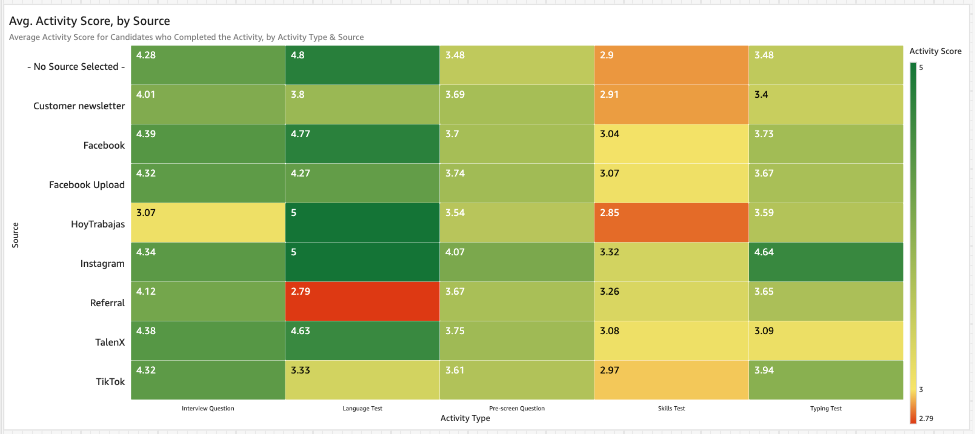
- Scroll down again and you should see a large heat map. This visual shows Average Activity Score based on Source and Activity Type. Hovering on this visual will reveal candidate counts which could assist in identifying outliers.
- Scrolling down again will reveal more visuals. These next 4 visuals compare sources with Locations and Jobs. The different colors represent the candidate source.

- Visuals on the left show counts of Candidates Sourced (by Location and Job), while the visuals on the right shows Hires Sourced (by Location and Job)
- The y axis for the top pair of visuals is "Location" (City), while the y axis for the bottom two is by "Job" (job req)
- Drilling up and down can be used on all of these visuals to see different levels of detail (city, state, country, or job profile vs job req)

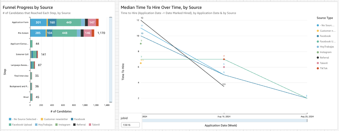
- Scrolling to the bottom will reveal the final two visuals on this tab. These last two are for deeper analysis. We recommend selecting only one Profile/Job Req (controls) when viewing these visuals for a more "apples to apples" comparison
- Funnel Progress by Source can help to show where sources may not be performing well in the funnel or where they excel. Steps (y axis) across Job Reqs will be combined if they have the same name
- Median Time to Hire Over Time, by Source may be useful to see if different sources are quicker to respond or are favored by recruiters
Post-Hire Effectiveness
This tab will look into how hires are performing, based on their source.
- Scroll to the top and click on the "Post-Hire Effectiveness" tab to open this dashboard
- Open the control panel by clicking on the word "Controls" or the dropdown arrow
- Similarly to the previous tab, all visuals are toggled between comparing "Source" and "Source Types". Make sure you select the appropriate option based on your search criteria

- Use the other controls to narrow your search based on your specific search criteria
- Start Date - Defines the hire dates of the Hires that you would like to see
- Job Profile - Job types to be included
- Job Req - Select specific job requisitions to be included
- Source Type - The type of origin or channel through which the candidate began applying to the job (e.g.. Social media, Job Board)
- Source - The specific origin or channel through which the candidate learned about and applied for the job (e.g.. Facebook, Referral)
- You can close the control panel by clicking on the word "Controls" or the dropdown arrow
- The first 4 visuals show the percentage of hires which reached different tenures, based on which source (y-axis) they came from. Colors represent:
- Green - Hires who were at the company for that amount of time
- Red - Hires that did not reach that amount of time at company
- Blue - Hires that are still at the company, but have not reached that amount of time

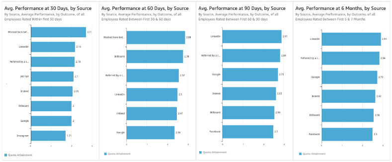
- Scroll down to the next group of visuals. These visuals show "Average Employee Performance", based on source, using the same time periods as the set of visuals above.
- Scrolling down again will reveal the final visual in this tab. This is a heatmap with all of the employee KPIs represented on the x-axis, and each source on the y-axis. Use the drop-down above the visual to filter time between an employee’s start date and the evaluation date

Exportable Data - This tab has several tables with data useful for export
- Scroll back to the top of the dashboard and select the "Exportable Data" tab

- You can click on the word "Controls" or the drop down on the right hand side to open and/or close the control panel
- The filters on this tab are the same as the first tab (Effectiveness Analysis), except for the "Source" versus "Source Type" dropdown are not present
- The first visual in this tab is the "Result Overview". It provides basic information similar to the last tab, to show which sources are best

- Scrolling down will reveal more visuals. These visuals show progress through the application process, and are best used when looking at only one, or very similar job reqs
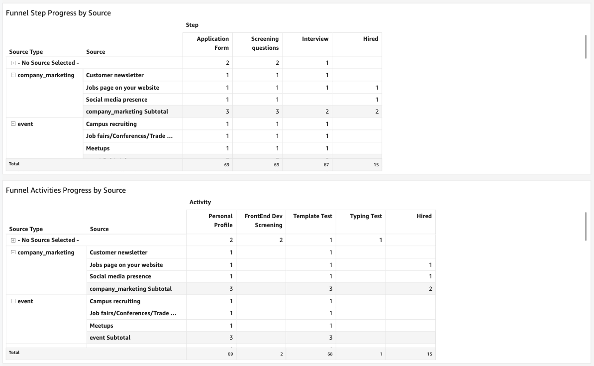
- Funnel Step Progress by Source - This visual shows how many candidates from each source reached a particular step in the hiring process
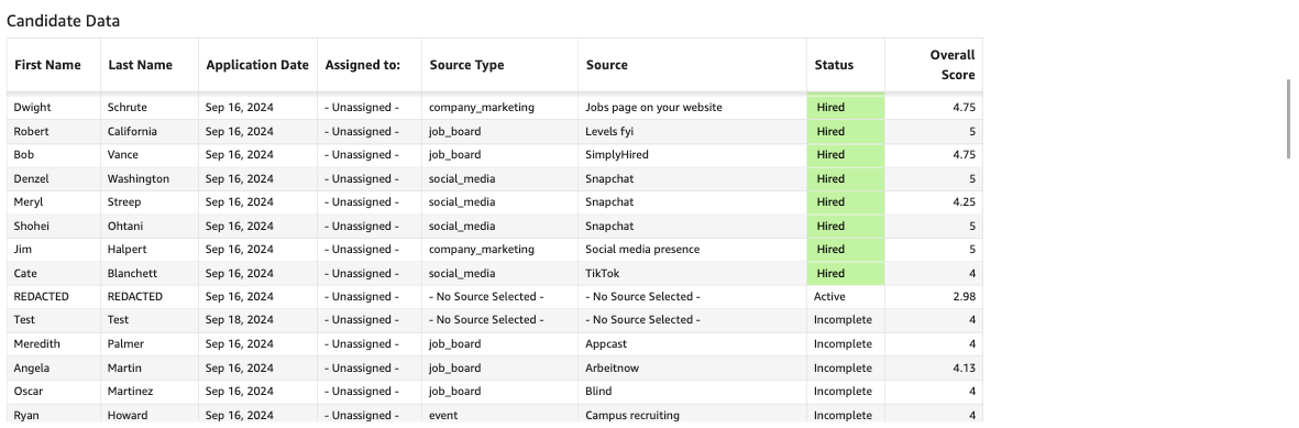
- Funnel Activities Progress by Source - This visual shows how many candidates from each source completed each of the activities
- Scroll down to reveal the final visual on this tab. This is a table with basic candidate data